Knowledge Visualization in Journalism

Nice video on the use of knowledge visualization, information visualization and info-graphics in the context of journalism. The first 10 minutes give a general introduction to the power of (conceptual) visualizations.

Glad to see people whom I know 🙂

KV blogs

It seems that the interest for knowledge visualization is growing in the blogosphere.

I came across a couple of interesting blogs on the topic of conceptual visualizations:

First discipline, by Joseph Manuel, India: “The FD framework is a collection of visual frames as a tool to provide inputs for discussion and convergence Reality is perceived as well as created by the mental models which have evolved over the history of humanity.”

Seeing it, by Massimo Warglien: new blog about visualization in strategy. The blog organizers have been presenting their work at the Academy of Management Meeting 2010 and at the Strategic Management Society.


Like This! Add to FacebookAdd to DiggAdd to Del.icio.usAdd to StumbleuponAdd to RedditAdd to BlinklistAdd to TwitterAdd to TechnoratiAdd to Yahoo BuzzAdd to Newsvine

Visualizing at the Emergence conference on India

This year the Emergence conference, organized by the University of St. Gallen, has focused on India. The amount of knowledge on India of the speakers was astonishing, a conference of really high quality.

I was pleased to see a large use of visual representations and sketching to moderate workshops. In the picture below the speakers of a workshop on microinsurance: Market based solutions at the base of the economic pyramid, used sketching and a poster with the Growing Inclusive Markets Strategy Matrix, a template developed by the UNDP (UN developing program) “for business trying to engage in BoP-projects or growing inclusive markets“.
By the way the concept of the “Base of the pyramid” is a powerful metaphor in itself.

Like This! Add to FacebookAdd to DiggAdd to Del.icio.usAdd to StumbleuponAdd to RedditAdd to BlinklistAdd to TwitterAdd to TechnoratiAdd to Yahoo BuzzAdd to Newsvine

Logic + Emotion visual blog

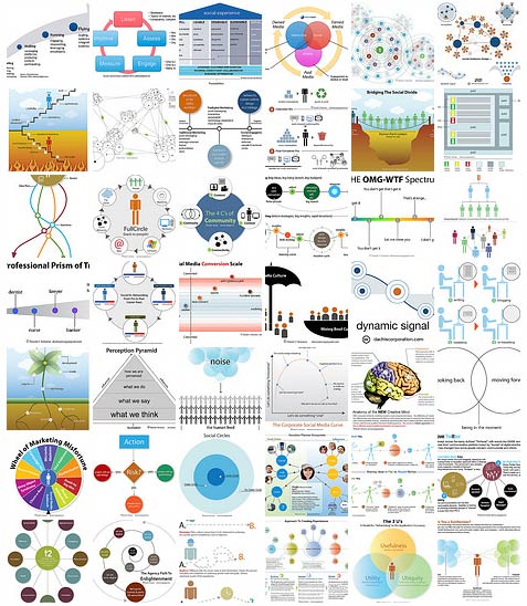
The Logic+ Emotion blog by David Armano is a valuable source of knowledge visualizations applied to the field of digital marketing. This popular and peculiar mix of social media and graphics emerges by the background of the author, vice president of the interactive arm of a global communication agency, who studied graphics and visual communication. He’s written papers, produced slideshows and videos, and has a gallery of knowledge visualizations, called “Visual Thinking archive” with diagrams, flowcharts, visual metaphors and infographics. (Found via Alex Mari)

Like This! Add to FacebookAdd to DiggAdd to Del.icio.usAdd to StumbleuponAdd to RedditAdd to BlinklistAdd to TwitterAdd to TechnoratiAdd to Yahoo BuzzAdd to Newsvine

Knowledge map of online communities

Randall Munroe, the young and famous  author of the xkcd webcomic, has just released a beautiful knowledge visualization. It’s the update of its online communities map. “Size on map represents volume of daily social activity”. The map is very well done showing both how the map is embedded into a bigger context (spoken language, email, sms, etc.) and providing as well zoom-in for the two hot topics of blogs and forums.

It’s a nice mix of informative content, providing overview and details, and hilarious jokes of the Web 2.0 mania, such as “desert of food updates” on twitter, “people you can’t unfriend“, and “the great firewall” between China and the rest of the map!

Online communities map

Like This! Add to FacebookAdd to DiggAdd to Del.icio.usAdd to StumbleuponAdd to RedditAdd to BlinklistAdd to TwitterAdd to TechnoratiAdd to Yahoo BuzzAdd to Newsvine

PowerPoint and the military

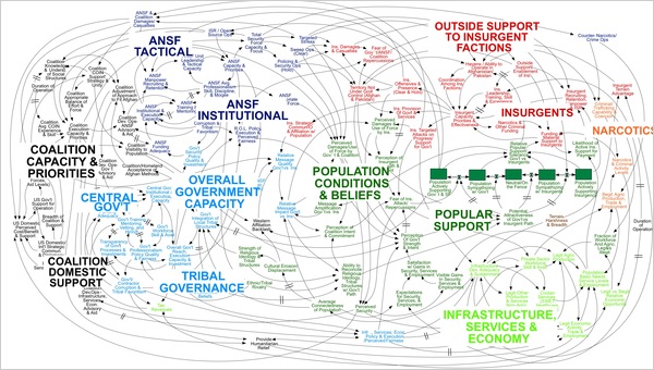
PowerPoint is under military investigation. The New York times reports: “We Have Met the Enemy and He Is PowerPoint” with an eloquent and provocative title, inspired by the so called spaghetti slide (see figure below). The leader of American and NATO forces in Afghanistan comment on the regards of this slide: “When we understand that slide, we’ll have won the war,” (NYT April 26, 2010). And he is not alone in thinking that Powerpoint is not the most suitable tool to display complex and relevant information for the military corps: the NYT article reports the complaints of a number of commanders, captains and generals.

More recently (15 Oct 2010) CNN reported that an army officer in Afghanistan was fired after publishing an essay complaining about useless PowerPoints. The “Why we hate PowerPoints — and how to fix them” article is authored by Nanacy Duarte, the famous design of Al Gore’s presentation on climate change. She argues that “PowerPoint isn’t inherently bad — just misunderstood” and provides  few tips for good presentations. It is key to have a good story, to use narrative techniques to connect the audience and move them to action; “Unfortunately, the development of presentations is a skill that is rarely taught and for which few sources of best practices exist. ”

Like This! Add to FacebookAdd to DiggAdd to Del.icio.usAdd to StumbleuponAdd to RedditAdd to BlinklistAdd to TwitterAdd to TechnoratiAdd to Yahoo BuzzAdd to Newsvine

Gartner Hype Cycle

Gartner has always made use of diagrams and visual representations to support managers in taking better decisions about technology investments.If you’d like to know more, have a look at our case study on Gartner (published at ecch)

They keep updating and improving their products, such as the Magic quadrant and the Hype Cycle, to include interactive features and support for collaborative decision making. In 2009 Gartner has updated and adapted the famous Hype Cycle to the recession:

Like This! Add to FacebookAdd to DiggAdd to Del.icio.usAdd to StumbleuponAdd to RedditAdd to BlinklistAdd to TwitterAdd to TechnoratiAdd to Yahoo BuzzAdd to Newsvine

The Web is dead. Is it?

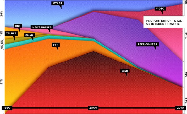
In September (2010) WIRED has published a controversial cover with the headline “The Web is dead“, referring to statistics provided by Cisco on the share of Internet traffic by the Web and other applications. The article, several pages long, claims that “Two decades after its inception, the World Wide Web has been eclipsed by skype, Netflix, peer-to-peer, and a quarter million other apps” (pg. 119).

It’s a remarable trand worth nothing, and the graph above certainly helps the reader to understand the point, however..

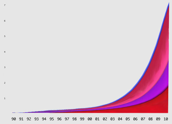
It depends on the perspective. Certainly the share of the Web is shrinking, but how about absolute numbers? Secondly, the graph is based on “traffic”, meaning quantity of information and bits exchanged, and clearly video and p2p application requires an exponentially higher volume of data than the Web for the same amount of time spent on the application.

Don’t take me wrong, i like the graph and the article, I just thought the presentation of information can be biased toward the message they want to convey (as we have discussed in our paper “The risks of visualization”, see publication session). and I’m not alone in these thoughts. Bloggers have picked up WIRED graph and produced an alternative version:

Like This! Add to FacebookAdd to DiggAdd to Del.icio.usAdd to StumbleuponAdd to RedditAdd to BlinklistAdd to TwitterAdd to TechnoratiAdd to Yahoo BuzzAdd to Newsvine

Swiss trains going visual

Swiss people are always efficient. Not to talk about Swiss trains, with their notorious punctuality and cleanness.

Now they are going one step further, employing useful visual representations  to decorate the train! Indeed they printed the map of the train  route on the tables, so passengers can entertain themselves looking at the map, learn about Swiss geography, and always know what are the next stops.

Switzerland is always ahead, so if they are using visuals on trains, I’m very confident this shows an upcoming trend!

Like This! Add to FacebookAdd to DiggAdd to Del.icio.usAdd to StumbleuponAdd to RedditAdd to BlinklistAdd to TwitterAdd to TechnoratiAdd to Yahoo BuzzAdd to Newsvine

WEIRD people: cultural differences in reasoning style and visual perception

When we travel to exotic countries, especially developing nations, we often find the locals to be kind of weird. But let’s be honest, we are the weird ones, because we are the minority.

I was very glad to find that some scholars had the same thought, and just published their research on the dangers of relying on Western samples for generalizing to the human population. As I previously posted, there is evidence of differences in visual perceptions and decision making across cultures (see Nisbett, The Geography of Thought), but few scientist have been investigating the topic.

Luckily a new era seems about to start.
Nature and Science have been covering the topic, reporting the results of a study on “The weirdest people in the world” by Henrich, Heine & Norenzayan (Behavioral & Brain Sciences, 2010), where WEIRD stands for
Western
Educated
Industrialized
Rich
Democratic
societies. They show how the result of experiments conducted in the United States and other industrialized societies are not representative of the human population as a whole.
Of particular interest for Knowledge Visualization is the difference in visual perception and spatial cognition. For example the Muller-Lyer illusion (in the picture below) seems to be stronger for westerners than for small-scale traditional societies. Similarly, in most of comparative studies Westerners, and particularly Americans, “occupy the extreme end of the human distribution” (pg.5).

There seems to be a general trend toward an understanding of the need to consider non-western perspectives, as confirmed by the next Academy of Management meeting theme “West meets East”
Stay tuned for our forthcoming experimental results comparing Europe and Asia 😉

Like This! Add to FacebookAdd to DiggAdd to Del.icio.usAdd to StumbleuponAdd to RedditAdd to BlinklistAdd to TwitterAdd to TechnoratiAdd to Yahoo BuzzAdd to Newsvine