Integrated (Presentation) Communication

Recently I attended the International Exploratory Workshop “Social Robots and Emotion: transcending the boundary between humans and ICTs”, which took place at Franklin College Switzerland. It was very stimulating and motivating, and I very much enjoyed the friendly atmosphere and intellectual talks. Special thanks to Satomi for the organization and to professor Katz for the suggestions!

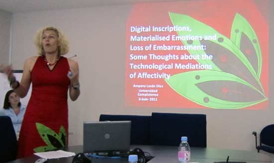
From a visual point of view I was very much impressed by the presentation by Professor Amparo Lazén Dìaz (Universidad Complutense de Madrid). I guess this could be called “Integrated Presentation Communication”, adapted from Integrated Marketing Communication! Wonderful and surprising matching of on-line and off-line communication 🙂
The Impact of Visual Mapping on Emotion and Cognition

The International Exploratory Workshop “Social Robots and Emotion: transcending the boundary between humans and ICTs” will take place at Franklin College Switzerland on June 3-4th 2011.

I will be presenting some new findings on “The Impact of Visual Mapping on Emotion and Cognition”. See the presentation.

Carolyn Dexter Award Nominee

Our paper “Communicating Strategy Across Cultures with Visualization: An Experimental Evaluation ” has been nominated for the Academy of Management’s Carolyn Dexter Award for best international paper!

The presentation will take place at the Academy of Management meeting on Tuesday August 16th 3:00PM at La Quinta Inn
http://program.aomonline.org/2011/submission.asp?mode=ShowSession&SessionID=2123

Abstract:

In this study we investigate the effects of conceptual visualization for the context of strategy communication. We predict that a visual representation of the strategic goals of an organization, compared to a textual representation, strengthens the intention to implement the strategy, mediated by attitude. Further, we combine theories on attitude-intention and the concept of the geography of thought, predicting an interaction of conceptual visualization form and culture on attitude, and consequently on intention. We test the model through an experiment with experienced professionals and find support for the predicted hypotheses of mediated moderation.

Epiday

Wednesday May 18th will take place USI’s EpiDay (Epi for EpistemologicalDay, but also HappyDay, if you wish).

I’ll be presenting my latest study, a cross-cultural experiment about the reception of knowledge visualization to communicate strategy in Europe, East Asia and South Asia (=India).
Here you can view my presentation and abstract. Feedback and comments are welcome.

IV conference

We are on the cover of the International Conference of Information Visualization 2011! My picture is right in the middle of the program booklet 🙂

The presentation of our paper “The Effectiveness of Knowledge Visualization for Organizational Communication in Europe and India” will take place Thursday 14th at 15:30 at the SOAS – The Brunei Gallery, London.

Visual instruction for managing your hotel room

Kartause Ittingen is an historical village of Switzerland, lost in the woods north-east of Zurich, where you can have truly peaceful corporate meetings. In fact the village has been beautifully renovated to host a conference center, surrounded by beautiful gardens, horses, sheep and museums, including a remarkable church.

Where is the academic part? Well, you enter your hotel room and you start to think you need a degree in engineering for operating it. There is a wooden cube in the middle of the room, with dozen of doors which are impossible to find. I think this “design piece” was created on purpose as a humility exercise. To make us remember that, although we are more or less academics, we are not that smart. Indeed I needed to read the instructions to find all the hidden functionalities of this post-moder piece of furniture.

Social Media Explained Visually

What is social media? A visual explanation!

Via Alex Mari

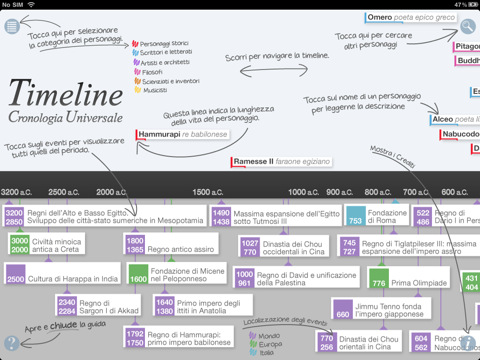
Interactive history timeline visualized for iPad

History is becoming modern: an interactive version of the the most relevant historical events have been developed for iPad by Garzanti. It promises to be more engaging than static timelines found in books and thus help learners to explore the content and learn more.

Political campaign in Ticino going visual

Political parties is Switzerland have often made large use of visuals during political campaigns, in particular the right-wing has used metaphors of black sheep and rats to refer to foreigners.

It seems to be a general trend that the left parties are picking up in response. In this Example below you see a knowledge visualization developed by the PS party, making fun of the “world view” of the “destra ticinese” (right wing parties of Ticino). Nevertheless the Lega dei Ticinesi won at the yesterday’s elections. It now becomes the biggest cantonal party with about 30% of votes, an increase of over 7% compared to the last elections in 2007.


@list PS

A Visual Approach to Cross-cultural Communication

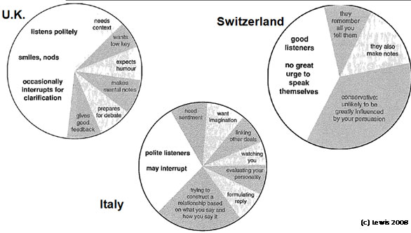
Much has been written about cross-cultural communication. Yet only few have tried to visualize it. Richard Lewis is proably the most comprehensive book using a visual approach to explain cross-cultural differences worldwide. His book “Cross-cultural Communication. A visual approach“, first published in 1999, has reached the Second Edition in 2008, widely expanded to 287 pages.

I am not sure what is the theoretical or rational motivation of the differnt drawings, nevertheless the book is useful to have a first sense of the differences across cultural groups regarding listening habits, meeting expectations and other managemerial communication topics.

Adapted from (c) Lewis, R. (2008) “Cross-cultural Communication. A visual approach”. Transcreen Publications; Auflage: 2nd Revised edition.

Like This! Add to FacebookAdd to DiggAdd to Del.icio.usAdd to StumbleuponAdd to RedditAdd to BlinklistAdd to TwitterAdd to TechnoratiAdd to Yahoo BuzzAdd to Newsvine