Presentations 2.0

Power-point used to be the gold standard for presentations. Not anymore.

Improving the visual appearance of slides, reducing the amount of text and increasing the number of pictures is not enough. Recent development in mapping software now allow anyone to create presentations that are actually maps and not a sequence of slides. Advantages are obvious (although not necessarily easy to implement): you can easily offer overview and zoom, show how things relate to each other and keep the “big picture”.

I already blogged about Prezi, which is making impressive improvements in every new release. More options are available, exploiting the same mapping principle.

Ahead is a web based mapping tool, similar to Prezi but with a few more options. Same principle: the basic version is free and your maps are public. If you want more options there’s a monthly subscription. Even their websites is made with Ahead!

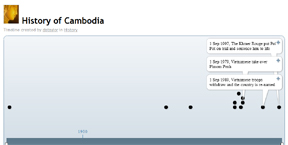
Timetoast is an interactive tool for creating timelines and roadmaps. As they say in the tag-line “to share the past, or even the future”.

Thank you Rahel for the hints!

Like This! Add to FacebookAdd to DiggAdd to Del.icio.usAdd to StumbleuponAdd to RedditAdd to BlinklistAdd to TwitterAdd to TechnoratiAdd to Yahoo BuzzAdd to Newsvine

7 Classic Foundational Vis Papers

In the post “7 Classic Foundational Vis Papers You Might not Want to Publicly Confess you Don’t Know” the blog author, Enrico Bertini, provides a list of foundation papers of information visualization, with a summary and comments for each paper. In his words it’s a ” collection of classics”: very useful and with a personal touch of insightful comments.

Like This! Add to FacebookAdd to DiggAdd to Del.icio.usAdd to StumbleuponAdd to RedditAdd to BlinklistAdd to TwitterAdd to TechnoratiAdd to Yahoo BuzzAdd to Newsvine

Visualizing insight: Reactive Business Intelligence book

An interesting description of visualization for business intelligence is provided in a forthcoming book by Roberto Battiti and Mauro Brunato. You can see online the pre-print version of the book “Reactive Business Intelligence. From Data to Models to Insight” , published by the Università di Trento (Italy) in December 2010.

The first chapters give a description of various information visualization techniques, from simple histograms to parallel coordinates and motion. In the second half of the book the authors explain advanced techniques for data visualization and modeling to gain business insight. To visualize the abstract concepts explained, they use visualizatios generated with the software program they developed, called Grapheur, a data mining and interactive visualization tool. A free evaluation copy is available for download.

The book is filled of nice quotes and comics as well: one of my favorites is the visual explanation of the dendrogram on page 49, and the definition of data mining on page 83: “Data Mining, noun 1. Torturing the data until it confesses. . . and if you torture it long enough, you can get it to confess to anything.” 😀

Like This! Add to FacebookAdd to DiggAdd to Del.icio.usAdd to StumbleuponAdd to RedditAdd to BlinklistAdd to TwitterAdd to TechnoratiAdd to Yahoo BuzzAdd to Newsvine

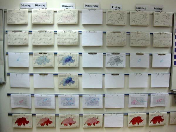
Geovisualization for predicting avalanche risk

The Institute for Snow and Avalanche Research SLF, located in Davos, makes a consistent use of geographic visualization to predict avalanche risk in Switzerland. Unlike weather forecast, they look at the past to make predictions. Very interesting serial mode to visualize information:

Thanks to Nicole and her husband for the insights!

Like This! Add to FacebookAdd to DiggAdd to Del.icio.usAdd to StumbleuponAdd to RedditAdd to BlinklistAdd to TwitterAdd to TechnoratiAdd to Yahoo BuzzAdd to Newsvine

Visual Davos

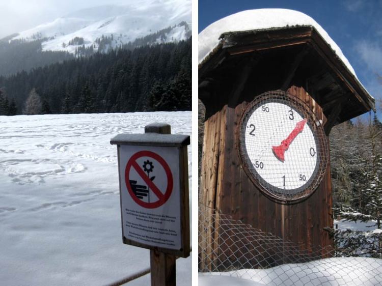
Some interesting visual material from Davos…

The picture on the left portraits a sign which seems a bit out of place, given the 60 cm of snow in Davos at the moment 🙂

For the picture on the right side, I need your help to understand what it is…
Seems unconventional that the “0” (zero) does not start on the top…

Like This! Add to FacebookAdd to DiggAdd to Del.icio.usAdd to StumbleuponAdd to RedditAdd to BlinklistAdd to TwitterAdd to TechnoratiAdd to Yahoo BuzzAdd to Newsvine

Visualizing Crime in Milan

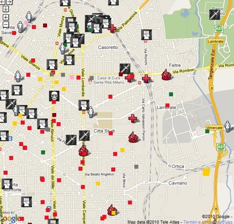
A “dark” knowledge visualization example: the map of the crimes committed in Milan in 2010, visualized by a journalist, Daniele Belleri, in his blog. This image below is a zoom on the area where I used to live in Milan (near via Padova), as found on il Corriere della Sera.

The map provides insights: “Risultati anche inattesi: più crimini sugli assi dello shopping che in alcune periferie dalla fama negativa” (Unexpected results: more crimes on the shopping streets than in some peripheries with bad name). Indeed more crimes around Piazzale Loreto than in the Bovisa area!

Useful information for locals and travelers.
Thanks Alice for the hint!

Oh yea, now I remember why I live in Switzerland.

Like This! Add to FacebookAdd to DiggAdd to Del.icio.usAdd to StumbleuponAdd to RedditAdd to BlinklistAdd to TwitterAdd to TechnoratiAdd to Yahoo BuzzAdd to Newsvine

The facebook world

Beautiful and informative.

Where is China by the way?

Like This! Add to FacebookAdd to DiggAdd to Del.icio.usAdd to StumbleuponAdd to RedditAdd to BlinklistAdd to TwitterAdd to TechnoratiAdd to Yahoo BuzzAdd to Newsvine

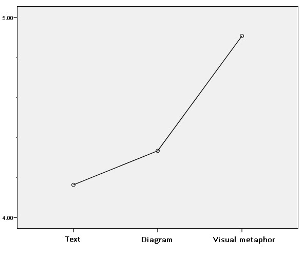
The effectiveness of Knowledge Visualization in India – results preview

In our previous studies we have shown that knowledge visualization is helpful in facilitating meeting and communicating strategy. Is it so only in Europe?

We are now expanding our cross-cultural experiment to India. We compare the results of people exposed to a textual or visual content.

The results of over 200 subjects in India confirm our previous results, showing that visualizing strategy has a positive effect on behavioral intention. In particular, when people are exposed to a representation of the strategy in the form of a visual metaphor, they like it better and they are more committed to implement it, compared to simple text or a diagrammatic representation. We find the same result pattern all over Asia, while Europeans prefer diagrams.

So what? If you communicate your content (as for example strategy) with knowledge visualization instead of text, your audience will probably like the content better and thus to be more committed to it. If you are communicating to Indians you should prefer visual metaphors, rather than bullet-point text or linear diagrams (like a timeline).

Like This! Add to FacebookAdd to DiggAdd to Del.icio.usAdd to StumbleuponAdd to RedditAdd to BlinklistAdd to TwitterAdd to TechnoratiAdd to Yahoo BuzzAdd to Newsvine

KV in museums

The new Museo del Novecento in Milan offers a knowledge visualization of its content, color coded by topic. The multiple visualizations and mapping seem a fusion style of architecture and info-graphics. It connects the themes in the abstract circle diagram to the physical map of the museum. Too bad that the words are too small to be read!

Like This! Add to FacebookAdd to DiggAdd to Del.icio.usAdd to StumbleuponAdd to RedditAdd to BlinklistAdd to TwitterAdd to TechnoratiAdd to Yahoo BuzzAdd to Newsvine

Digital pen (and interactive paper)

At the University of Lugano, faculty of Informatics, we just had a nice talk about pen and paper computing, by Nadir Weibel. An ETH gradate, he’s currently a post-doc at UCSD in California, at the Distributed Cognition and Human-Computer Interaction Lab.It seems a great place to be for Human computer Interaction research, experimenting on innovative input devices.

He used his digital pen and interactive paper for giving his presentation and brought a few samples for the audience. They are inventing/testing new applications of the electronic paper: you write with a normal pen (well, it looks normal, but it has a camera and sends the information to the computer or to the mobile) and your writing or drawing is recorded and/or sent to the computer, depending on the model of digital pen you have.

They use it for example for sharing sketches via mobile on fecebook, as an input device for very large wall displays, for interacting in a group, etc.

I could imagine to use it in a collaborative setting, where every person in the meeting can add its contribution… but still my sketching skills are a problem 😉

Like This! Add to FacebookAdd to DiggAdd to Del.icio.usAdd to StumbleuponAdd to RedditAdd to BlinklistAdd to TwitterAdd to TechnoratiAdd to Yahoo BuzzAdd to Newsvine