IV 10 conference Best paper award

The 14th International Conference on Information Visualization, held in London, is just over (26-29 July 2010).

We are very glad and honored to have received the best paper award for our paper “Choosing Knowledge Visualizations to Augment Cognition: the Managers’ View”, forthcoming in the IEEE proceedings of the conference.

Abstract:  Growing evidence in the scientific literature and in organizations shows the positive impact of employing conceptual visual representation for individual reasoning, communicating and facilitating meetings in organizations. 116 managers responded a questionnaire on the usefulness of 12 common business visualizations for typical knowledge tasks in organizations. The resulting ranking provides an overview of the comparative suitability of visualizations for generating ideas, sharing knowledge, evaluating options and planning. The findings can be used by organizations for evaluating visual templates as a support for specific knowledge tasks. Theoretical implications include the relationship between the structure level of knowledge visualization forms and convergent/divergent task type. Further implications for theory and practice are discussed.

Like This! Add to FacebookAdd to DiggAdd to Del.icio.usAdd to StumbleuponAdd to RedditAdd to BlinklistAdd to TwitterAdd to TechnoratiAdd to Yahoo BuzzAdd to Newsvine

Sociological images

Sociological Images: Seeing is Believing is designed to encourage all kinds of people to exercise and develop their sociological imagination by presenting brief sociological discussions of compelling and timely imagery that spans the breadth of sociological inquiry.”

Sociological Images is an interesting blog that uses pictures to provoke and discuss current sociological issues, from ads to infographs, barcharts to videos. Similarly “Graphic Sociology” provides a collection in infographics and infovis on the topic of sociology:

Like This!

Add to FacebookAdd to DiggAdd to Del.icio.usAdd to StumbleuponAdd to RedditAdd to BlinklistAdd to TwitterAdd to TechnoratiAdd to Yahoo BuzzAdd to Newsvine

Social Media Graphics

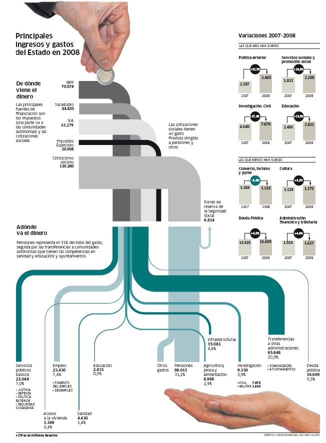
The social media universe is continuing to attract the attention of graphic designers, that use infographics, charts and graphs to explain, provide insights and explore creatively the Web 2.0.

This blog on Social Media Graphics provides a collection of interesting and colorful graphs, by Michael Schulz. From the same author also interesting collections of shapes and colors.

Like This!

Add to FacebookAdd to DiggAdd to Del.icio.usAdd to StumbleuponAdd to RedditAdd to BlinklistAdd to TwitterAdd to TechnoratiAdd to Yahoo BuzzAdd to Newsvine

Eye tracking

Eye tracking at the University of Oxford, department of Psychology.

The black tool at the bottom is the eye tracking machine, version 1200. The little violet dot on the screen is the position where the subject is currently looking at, tracked in real time. This pictue on the screen is used for the initial calibration, which needs to be done for each subject.

Eye tracking is increasingly used in the study of visual representations, human computer interaction, marketing, etc. I was amazed to learn that is now used to study political choice, and they found that democrats and republicans look at different parts of the same picture!! For example they look at the aggressor or at the victim. There are also remarkable gender differences on the focus of images.

A simple and very powerful tool for studying visual representations.

Like This!

Add to FacebookAdd to DiggAdd to Del.icio.usAdd to StumbleuponAdd to RedditAdd to BlinklistAdd to TwitterAdd to TechnoratiAdd to Yahoo BuzzAdd to Newsvine

Knowledge visualization marketing

An example of knowledge visualization on the move 🙂 from Oxford, UK.

The period table is probably the most amazing example of knowledge visualization: it enables insights (indeed, to understand that some elements were not yet discovered!), offers overview-zoom, and details on demand (if you have an interactive version) as in Schneiderman’s mantra, it’s color coded for an easier navigation, and can also be used for visually pleasant marketing activities, as above!

Add to FacebookAdd to DiggAdd to Del.icio.usAdd to StumbleuponAdd to RedditAdd to BlinklistAdd to TwitterAdd to TechnoratiAdd to Yahoo BuzzAdd to Newsvine

Cultural differences in the perception and representation of space

Professor Holenstein just gave an interesting seminar at USI on the cultural differences in the representation of space. He is one of the world major expert on the topic. He is the author of the Atlas of Philosophy (2004).

I found interesting to hear his philosophical perspective on a topic I am particularly interested in, which is typically addressed from a mere cognitive point of view. He showed how Japanese people depict their country, with the main axes  east-west. while we typically think of Japan as a land that is mainly distributed vertically (north-south) like Italy.

He also reflected on how geographical maps cannot be objective depictions of reality but a product of what the cartographer wants to emphasize. Therefore I suppose they can as well be considered knowledge visualization, with a close mapping to the original distribution of information.
The traditional world map is a product of conventions, indeed many types of world maps exists with different orientations, upside down or east-west, like this Japanese map of 1671:

Add to FacebookAdd to DiggAdd to Del.icio.usAdd to StumbleuponAdd to RedditAdd to BlinklistAdd to TwitterAdd to TechnoratiAdd to Yahoo BuzzAdd to Newsvine

Social Media Marketing Knowledge maps

I have posted earlier on the increasing use of visualization from the social media community. Now it is not only about information visualization; there are also beautiful infographics and useful knowledge maps. See this collection of Web 2.0 knowledge maps for an overview: From mindmaps and matrices, to visual metaphors and process diagrams.  (Thanks Alex for the pointer!)

Like This!

Add to FacebookAdd to DiggAdd to Del.icio.usAdd to StumbleuponAdd to RedditAdd to BlinklistAdd to TwitterAdd to TechnoratiAdd to Yahoo BuzzAdd to Newsvine

Multiple mice

Knowledge visualization gets more interactive when the group participants can share the same screen and nevertheless have their own mouse, as in the picture.

A few software are now allowing this type of interactive collaboration, called multiple mice or single-screen groupware. Wunderworks offers a free download of their software that lets you connect 3 mice, and each will have a different color. It can be used with any software, so I have tested it with a mapping software, and asked 3 students to move objects at the same time. Technically it works very fine, I think the challenge is in the task!!

Microsoft offers the Mouse Mischief, to be used with Powerpoint for educative purposes. It’s free and easy to install. It seems that the target are joung children since the mouse icons are represented by animals. I’m looking forward to test it in class.

Like This!

Add to FacebookAdd to DiggAdd to Del.icio.usAdd to StumbleuponAdd to RedditAdd to BlinklistAdd to TwitterAdd to TechnoratiAdd to Yahoo BuzzAdd to Newsvine

The Social Media Jungle

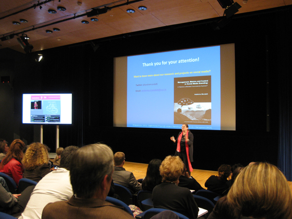
The Lac Leman Forum this year organized a practitioner oriented conference “Navigating the Social Media Jungle”. It was held at the beautiful Olympic Museum in Lausanne. The keynote speakers covered a variety of topics, from Paul Argenti on Corporate Communication, insights on the social media strategy of the World Economic forum (Monck), to the legal issues of Web 2.0 (prof. Cottier)  and the metrics in social media branding (Prof. Mandelli, in the picture).
All the speakers made consistent use of visualization to explain their examples, models and ideas. It seems that Web 2.0 and Social Media have a strong vocation on using visualization, as in this list of “10 outstanding Social Media infographics”

Like This! Add to FacebookAdd to DiggAdd to Del.icio.usAdd to StumbleuponAdd to RedditAdd to BlinklistAdd to TwitterAdd to TechnoratiAdd to Yahoo BuzzAdd to Newsvine

Prezi allows printing

Finally the software Prezi has added an option for saving pdfs and printing. I believe this is a major improvement to allow the use of Prezi in education and for meetings where handouts are necessary.
I like this mapping software because it allows to see the overview and then freely zoom into the topics, instead of cluttering information as in powerpoint. I hope they will continue adding new features, especially with fonts and styles.