The rise of collaboration

“Yochai Benkler dubs it ‘the wealth of networks.” Howard Rheingold’s term is “smart mobs.” It’s the idea of technology-enabled collaboration … and it’s making us all smarter.”

This is how TED Talks introduce their new theme “The rise of collaboration“, a great compilation of videos on the topic of collaboration and why it makes the world better. Knowledge visualization is primarily collaborative, as its aim is typically to share knowledge, take decisions in group, brainstorm or communicate actions and plans. It can be done in group work, like when you use a mind map in a meeting (what is called co-located synchronous), or remotely, like Google maps where everyone can contribute, any time.

The role of visualization in the rise of technology-enabled collaboration is threefold. Firstly, as the quantity of information on the web is rising exponentially, visualization can help to aggregate this knowledge and display an overview for an easier comprehension and navigation of the content. Secondly it can help to understand the amount of the contributions (i.e. visualizing the quantity of contributions per user). Finally it can be used to map a domain, by allowing different users to add their contributions to a common visualization template (i.e. a geographical map, a knowledge map or a visual metaphor) to create a shared picture (and understanding) of the topic…

…. the rise of collaboration visualization!

Virtual Worlds

Virtual worlds are serious business. Their use in companies is still rather limited but very promising. They are used to host shareholder meeting (like ArcelorMittal), sell virtual goods and share knowledge. This last aspect is thus far greatly neglected but visualizing information and knowledge in group has the potential to make the collaboration more focused, memorable and productive. Andreas Schmeil gave an illuminating guest lecture on the topic in the course of Visualization in Business Communication, at the University of Lugano. Virtual Worlds – like Second Life – can provide a unique experience for collaborative work and collaborative learning. It seems that the challenge is still in the creative design of virtual experiences that provide added value and go beyond the (boring) reproduction of the real world.

Visual communication across cultures

As the (business) world becomes more and more flat (Friedman, 2006, p. 376), visual communication can be particularly helpful for getting a message across various cultures, thanks to its ability to convey a message with
symbols and pictograms that can be – often – universally understood. However, the impact of cultural differences on visualization interpretation is frequently overlooked.

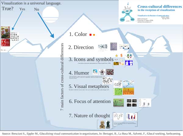
In this presentation I draw an overview of our forthcoming book chapter on the topic of Cross-cultural differences in the reception of visualization. It’s based on a thematic analysis of literature from various fields (Psychology, intercultural studies, business, visual communication) and my experience in Asia during the recent research stay in Singapore (NUS).

I’m currently still working on the topic: your feedback is welcome! 🙂

Knowledge visualization with a Group Support System

This image is the result of using visualization to share knowledge in class.
I’ve used lets-focus, a business mapping software, over a network. Master students were working in groups; each group had a laptop with the (empty) template above – called perspective diagram. They were asked to brainstorm on the topic of Visualization for Presentations: advantages/good practices, disadvantages/problems, issues and open questions.
Then I asked them to send their ideas (icons and text) to my computer through the network. When they sent a contribution it was visualized in real time on my computer, which was connected to the class projector, therefore everyone could see the development of the visualization. Each group was assigned a color, so that the owner of each contribution was identifiable. It also helped to motivate groups to contribute equally (visual pressure). The ideas sent by the students were then commented and placed into the context of the discussed topic and of the course.
The game worked out very nicely, it seems a promising way to enhance teaching. Firstly it lets the students experiment an innovative tool that can be used in organizations for knowledge sharing and brainstorming. Secondly it engages student to participate actively in class, learn from their peers and re-elaborate their knowledge by visualizing it.
The results are very promising, I believe there is a great potential of application for this kind of visual groupware, both in organizations and in education, on which I would like to experiment more in the future!

Visual explanations

This poster uses visualization to educate people about water, by comparing the cost and quality of tap water to bottled water. It’s eye catching and effective because it employs visual images both as icons and as means for comparing and explaining.

The Facts About Bottled Water

Mapping the difference between science and faith

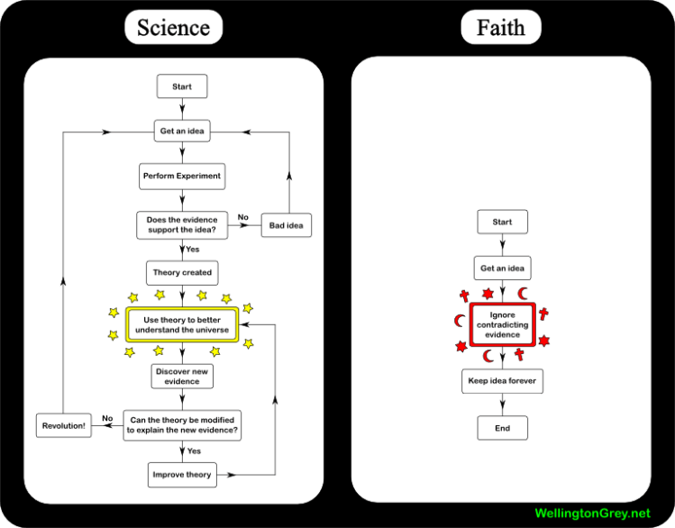
This is an interesting application of the flowchart to try to explain deep philosophical issues.

It’s thought provoking, indeed it has received a number of divergent comments on other blogs. It is quite arguably an oversemplification of reality, however it serves the purpose of conveying instantly the difference between the two domains.

A version 2.0 was developed to improve the science diagram. This interesting re-appropriation process shows the potential of web 2.0 for visualization, that can be shared online, receive feedback and improved collectively.

Knowledege visualization of muslim scientific heritage

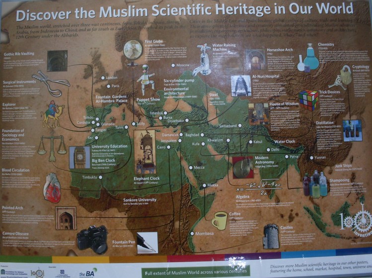
I found this interesting cartographic knowledge visualization in Jamae mosque in Singapore. In this mosque, located in Chinatown, they make a great use of visualizations for illustrating concepts and information about the Islamic world and religion principles. It is certainly an interesting place to visit to learn more about Islamic religion: they offer pamphlets on several topics and the main praying hall is surrounded by well-crafted illustrations of how Muslim pray, historical background,  information on culture, etc.

In the image below, a world map is used as a base to highlight the cultural and scientific contributions of Muslims around the world. It is a good example of how to blend pictures and text: images are used both as a mapping background and as explanatory icons.

Source: Jamae Mosque, Singapore

Data Visualization tools

A recent post on O’Reily media RIA’s blog portraits  a useful collection of 28 data visualization software. It seems that different industries are employing diverse tools for the same goal of visualizing rich data, from very fancy like anychart and axiis, to powerful applications supporting millions of data-points like chronoscope.

Source: axiis - Inside RIA O'Reilly

Cross-cultural differences in symbols

Toilet symbol in AsiaAt the moment I am in Singapore conducting cross-cultural research on visualization, and -beside experimenting – I’ve also been hunting for differences in the use of visualization around the city.

Despite Singapore is quite western, and English is the major language, I noticed a consistent use of visualization on packaging instructions and posters explaining rules of behaviors. This might be due to the fact that there are 4 national languages, and not everybody understand English (new immigrants or older folks), so vignettes are an effective way to communicate across language differences.

Here’s a picture I took in Chinatown, the toilet sign! 😉

Information visualization on BBC

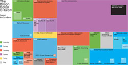
mcCandless
source: mcCandless via BBC

The BBC magazine recently featured an article about how information visualization is becoming a serious business to overcome information overload and help readers understand information more easily. The article shows beautiful infovis examples by David McCandless, author of the book “Information is Beautiful” which will be published in February by Collins in UK.