The observatory of Economic complexity is a website created by MIT Media lab to display visually the economic complexity of countries.
You can compare infovis of exports of different countries to grasp the differences: my favourite is the treemap, a powerful information visualization technique invented by Ben Schneiderman and refined by his collaborators through the years.
Let’s see Switzerland:
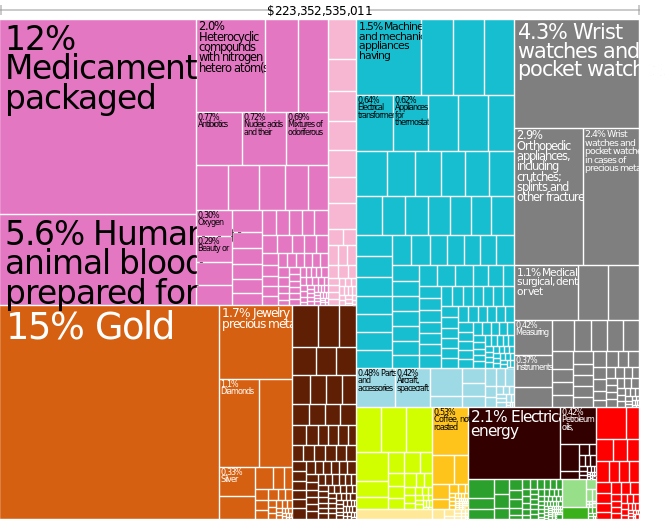
Quite surprisingly the major export of Switzerland is gold! Followed by chemicals, medicaments and “human and animal blood”! Who would have guessed so?
And now let’s compare it to India:

India is also exporting precious jewellery. with a qucick look you can compare colours and the size of the rectangles to have an overview of the differnt sectors the two coutries specialize in. See the interactive version on the MIT website, and you can also trace change in time of coutries’ economic complexity.

It’s awesome to pay a visit this web page and reading the views of all friends concerning this post, while I am also eager of
getting knowledge.